P:ear case study
Improving usability and information architecture
THE PROBLEM
Navigating pearmentor.org and finding the opportunity to volunteer is difficult. We prioritized this feature so newcomers can get connected with volunteer services easily.
My role
Microinteraction designer, art direction, storyboard artist
tools used
Figma
Adobe Illustrator
Adobe Photoshop
Google Sheets
Discord
FINAL PROTOTYPE - DESKTOP
FINAL PROTOTYPE - MOBILE
Design Process
Our plan was to define what about the website needed improvement, first by reaching out to employees at p:ear and letting that inform our research. We would examine the websites of similar organizations, conduct a heuristic analysis of pearmentor.org, and redesign the website to improve navigation and information architecture. After this, we would create clickable prototypes in Figma for mobile and desktop views.
Research
I began by reaching out to Stephanie Chase, Operations Manager for p:ear. I asked a series of questions that might inform our solution finding, such as:
Have users reported any issues with the website, either on mobile or desktop?
Are you happy with the website? Are there any changes you’d like to make?
If you could change one thing about the website what would it be?
Are there any unique problems p:ear faces that would be better served by technology?
What’s your favorite thing about the website?
Her feedback boiled down to one general change for the website:
“Simpler and condensed.”
We took notes on our own, mostly noting issues with the website’s navigation that we hoped to address.
Inconsistent capitalization looked unprofessional
Inconsistent navigation, no indication that half the options are drop down menus
Mission statement and volunteer pages are buried and hard to find
Fast Facts popout isn’t very useful, as most of that information is easily findable elsewhere and other information is more pressing
The website can be difficult to navigate, and information on careers is hard to find. This was backed up by Stephanie’s response to my earlier email, who reported the same issues
COMPARATIVE ANALYSIS
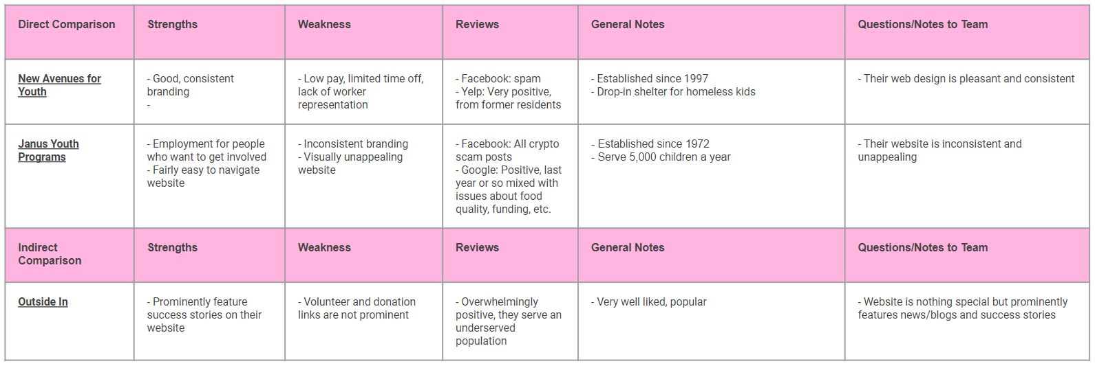
We looked at other organizations serving similar functions and compared their branding, website, and services to p:ear’s in an effort to better understand the role these organizations serve. We found that even though these organizations serve slightly different purposes, many focus on easy to use websites that feature success stories from the communities they serve.
Comparative analysis comparing p:ear with similar organizations.
DEFINITION
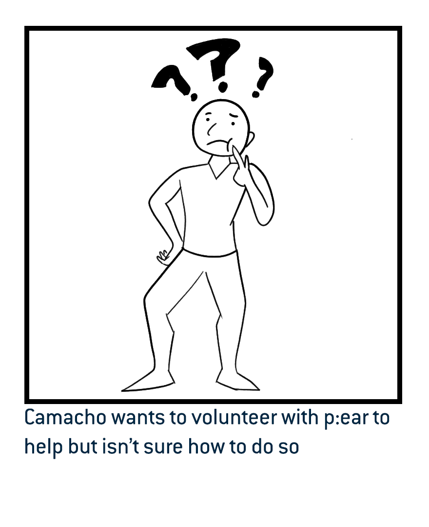
We created a persona named Camacho, seeking to volunteer with p:ear. His needs and pain points led us to find our Problem Statement:
Camacho wants to volunteer with p:ear, but is having trouble navigating the website. Ideally the opportunity to volunteer would be more prominent and allow for an easier experience signing up. We suggest a redesign prioritizing this feature so newcomers can get connected with volunteer services easily.
Based on this Problem Statement, I illustrated a storyboard of how we would solve this problem using Adobe Photoshop.
STORYBOARD
JOURNEY MAP
We created a Journey Map based on this storyboard and some common actions, highlighting the user’s emotions and ideating opportunities for improvement.
HEURISTICS
We analyzed the existing website, annotating the page, finding what we liked, what we disliked, what could be improved, and how.
INFORMATION ARCHITECTURE
We generally liked the sitemap of the existing website, but had some ideas for improvement. We prioritized the organization’s mission statement, highlighting their effect and fleshing out their events page. We also incorporated more opportunities to volunteer, adding a “donate your time” feature to the Donations page, and adding a Success Stories section like we saw on other, similar organizations’ websites.
At this step we created a sample flow for how a user would find their way to the volunteer section of the website. The goal would be to have a means of volunteering through the donation page, as well as a more prominent volunteer button on the homepage.
PROTOTYPING
We analyzed the hierarchy of the existing page and rearranged the elements we felt were most important. We moved their work programs further down the page and replaced them in the header with the two most important options for a would-be volunteer: Donate and Volunteer. We kept the hero video at the top of the page, and styled the navbar to have a capitalization scheme consistent with the rest of the website.
We wanted to increase readability in our reorganization. The As a Youth/Volunteer/Donor buttons didn’t read as buttons, so we changed them to cards and reinforced their functions with related imagery.
For the mobile version of the website, we wanted to make the action buttons for donation and volunteering even more prominent than the desktop version, and worked to ensure they were easily usable on a small screen. We also incorporated carousel galleries and cards to better take advantage of the mobile format and break up the experience of scrolling down a long page.
IDEATION
In the Ideation phase, Jenny assembled a moodboard based on similar organizations, inspirational imagery, and p:ear’s existing branding. I designed a style tile, building a color palette and font library based on the existing content in pearmentor.org’s CSS.
We kept the rest of the imagery consistent with the existing website, using their photos for the banners and cards. These pictures show their volunteers and the young people they serve, and they already tell p:ear’s story wonderfully.
With the colors, fonts, and functionality decided, I created a simple set of buttons to be reused throughout the website.
TESTING
Two user tests were performed over Discord. Owen shared his screen and had users direct him to navigate through the website, noting any usability issues. He asked them interview questions to discover issues with our prototype which he then recorded.
After testing, we boiled down the feedback into the most actionable changes we could make with our remaining time.
TESTING RESULTS
Some of the text was hard to read
Outcome: Change body text from Thin to Book, increase font size
Donation page should have lower increments available
Outcome: Added lower cost donation options
We’ve focused on would-be donors/volunteers, but what about people who need p:ear’s services?
Outcome: Added a bug on every page that users can click to take them straight to the “For Youth” page
CONCLUSION
We believed in p:ear’s mission and felt that we could create a website that would better serve both its clientele and volunteers.
Testing challenged our preconceived notions and helped us improve readability and add new features
Talking with Stephanie Chase at p:ear helped us identify usability issues and what to focus our efforts on
When designing the mobile version of the site, we had to reconsider the hierarchy of each page to fit the vertical format


