
Strike Arena: AR Card Game case study
Creating an AR Card Game

Value Proposition
Discover a new dimension of fun and strategy with Strike Arena, our cutting-edge augmented reality card battle app. Dive into immersive gameplay where your cards come to life in stunning 3D right on your screen. Enjoy seamless integration with your device for an interactive experience that blends physical and digital worlds.
My role
Art Director, Project Manager, Microinteraction Designer, Graphic Designer, Illustrator, Storyboard Artist
tools used
Figma
Adobe Illustrator
Adobe Photoshop
Google Sheets
Google Forms
Discord
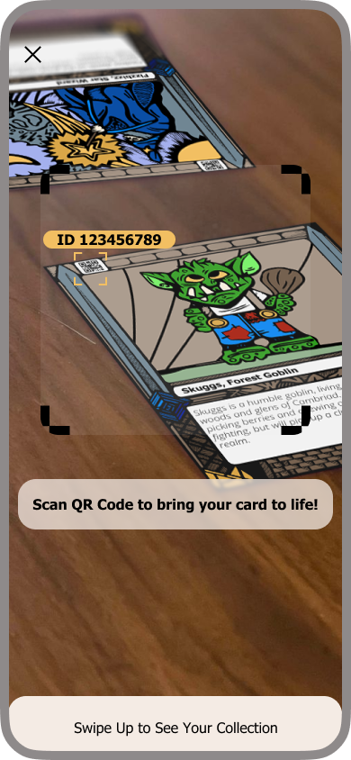
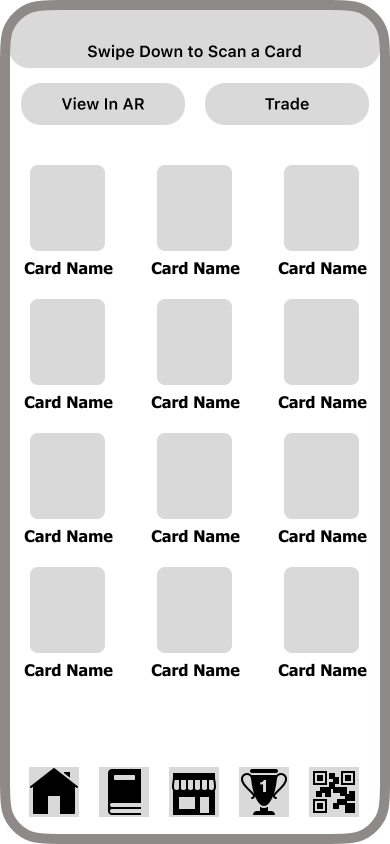
FINAL PROTOTYPE - SCAN CARD


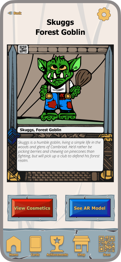
FINAL PROTOTYPE - TRADE CARD

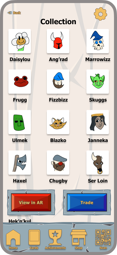


High Fidelity Clickable Prototype - Trade Card

DesignING STRIKE ARENA

As a group of designers passionate about games, cards, and art, we wanted to leverage our expertise and domain knowledge to make something we not only hadn’t seen before, but would want to engage with ourselves. We thought about what we loved most about card games - collectability, art, and their social aspects - and asked ourselves how we would pair these with modern technology.
This project would by its nature be art-forward, with visual design informing the functionality of the app.
Research PLAN
We conducted a comparative analysis on other card game and collectible AR apps to analyze their functionality and find what would make Strike Arena stand out. We gathered qualitative research through 1-on-1 interviews, as well as quantitative research through a survey form we sent out to our online communities.
COMPARATIVE ANALYSIS
We looked at other organizations serving similar functions and compared their branding, website, and services to p:ear’s in an effort to better understand the role these organizations serve. We found that even though these organizations serve slightly different purposes, many focus on easy to use websites that feature success stories from the communities they serve.

Comparative analysis comparing other digital card games and AR experiences
Comparative Analysis Takeaways
“Physical” feeling UI can immerse users in the experience, giving the app a tangible, valuable feel while also giving opportunities for microinteractions
“Pay to win” and random-feeling features make users unhappy
Apps need several features to draw users in
Regular content updates keep users coming back
Trading feature would make our app distinctive
Full research is available here
Quantitative Research
We formulated 13 questions and our head researcher, Owen, assembled them on a Google Form, which we distributed among our online communities. Between August 2nd and August 4th we received 30 responses, and were able to identify some key data points important to our prospective users. Owen then formatted that information into easily readable information.
What types of features would you most like to see in a mobile card game?

What are your biggest pain points with mobile games?
Who do you like to play games with?

How much would you be willing to spend on a physical card game that incorporates AR technology?

Quantitative Research Takeaways
Over 51% of surveyed individuals preferred to play with their friends over strangers or solo play
64% of users surveyed would be willing to pay over $10 to buy in to our game, with 20% willing to spend $10-$30, another 20% willing to spend $30-$50, and the remaining 24% willing to spend even more. From this data we can gather the average user will be happy to pay for a game utilizing this technology.
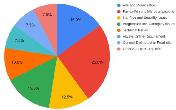
40% of surveyed individuals felt pain in their wallet, as microtransactions, pay to win features, and advertisements were their biggest pain points
Full research is available here
Feature Prioritization
Using our own ideas as well as suggestions from those surveyed, we assembled a feature prioritization matrix to guide us on where to focus our efforts for this case study, as well as future development.
Our primary goals for this project would be trading cards, adding new cards to a user’s collection, and battling with other users.
Figma Jam link here
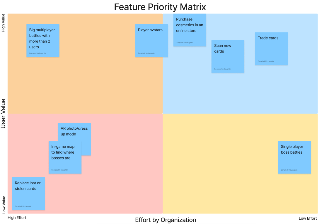
Feature priority matrix, outlining ideas for features, the effort they require, and the value they provide
DEFINITION

We created a persona based on the kind of person we thought would be interested in our app - a regular mobile and card game player looking to engage with his more casual friends and family.
STORYBOARD


USER FLOWS
We created user flows for the key features of our app. The Scan and Trade flows are simple and fairly linear, while the Battle flow involves more choices and opportunities for social media integration.

User Flow - Scan Card

User Flow - Trade Card

User Flow - Battle
Art and design
Visual appeal would be key to this app, and we wanted to make something as engaging as the card games that inspired us in the first place.
Moodboard
We assembled a moodboard, focusing on other card games and AR apps. We found color, physical texture, and appealing characters were the common elements between these. These would be our priorities for the overall aesthetic of this project.
Figma Jam link here

Illustration
Rough sketches helped communicate what we wanted this app to look and feel like. When working with abstract concepts and unproven features, visual representations are key in getting a point across.
Joe sketched a logo, initial card designs and characters, which I then refined and iterated on in Adobe Illustrator. I then took these initial character designs and created more 3-dimensional versions of them in Photoshop. These would be used in mockups of final screenshots when showing off our proposed AR features.

Initial sketch and notes for what would become Strike Arena

Joe’s sketch (left) my finished card design (center) and my developed character illustration (right)
Color, Typography, and Component Creation
I assembled a style tile, focusing on bright gem tones contrasting with more neutral wood and metal colors. Tahoma was chosen as a legible and web-safe font. I also designed a number of buttons, elements, and other components for the app, aiming for a fantastical, physical look with gem, stone, and gold textures.
Figma link here

Strike Arena style tile
PROTOTYPING
Scan Flow - Low Fidelity Prototype


High Fidelity Prototype Wireframe

Final Prototype
TESTING
We performed 3 in-person tests and gathered the following data:
Navigation felt natural, and the navigation bar at the bottom was helpful, with the user regularly returning to it for navigation
Users generally preferred “scrolling” based navigation as opposed to our more tab/page-based approach
Users found the aesthetic to be cartoony and not what they’re used to from typical apps, comparing it to early 2000s games like Neopets
NEXT STEPS
Testing, testing, testing!
Biannual set releases to reinvigorate the game with new characters and new themes
New cards for items and battlefields, deepening play and giving players new cards to collect
Crossover branding possibilities using other characters and worlds like Dungeons & Dragons, Lord of the Rings, and Marvel
Expanded game modes for 4 or more players
AR photo mode, where users could pose and dress up their characters in cosmetics they’ve earned and share their photos
Store with cosmetic items such as seasonal character skins, UI themes
Developing our IP to create tie-in merchandise and media such as plushies, action figures, animated shows, and other games

CONCLUSION

Creating a holistic app where the UI, game design, physical cards, and concept all worked in tandem was a challenge. We weren’t just designing a card game, AR app, and IP, but a business strategy. Explaining the concept, let alone bringing it to life, was a struggle, but the final results were rewarding
This project was hugely collaborative, with each of us getting to use our own personal skill sets and our collective domain knowledge of games, collectibles, and fantasy worlds to make our own mark on Strike Arena
Our research showed that people were not only willing to give this idea a shot, but willing to spend $10-$30 to do so, showing that this idea for a business has potential